
UI
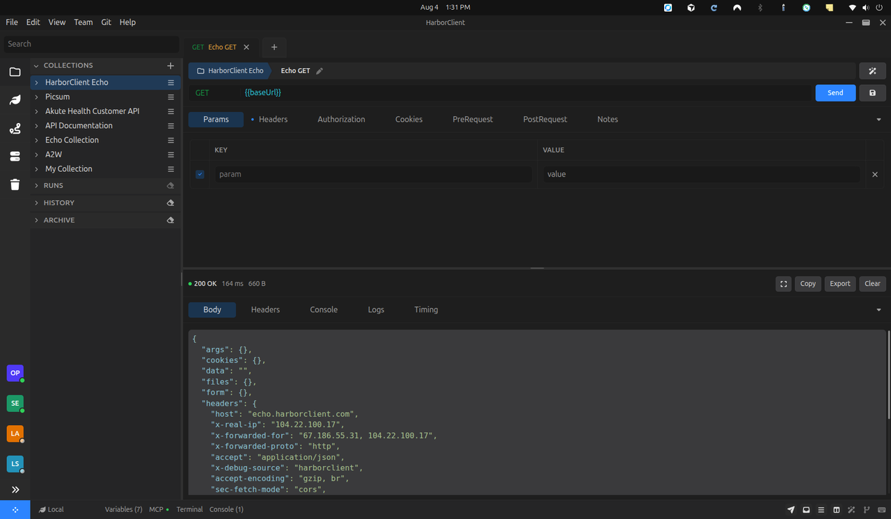
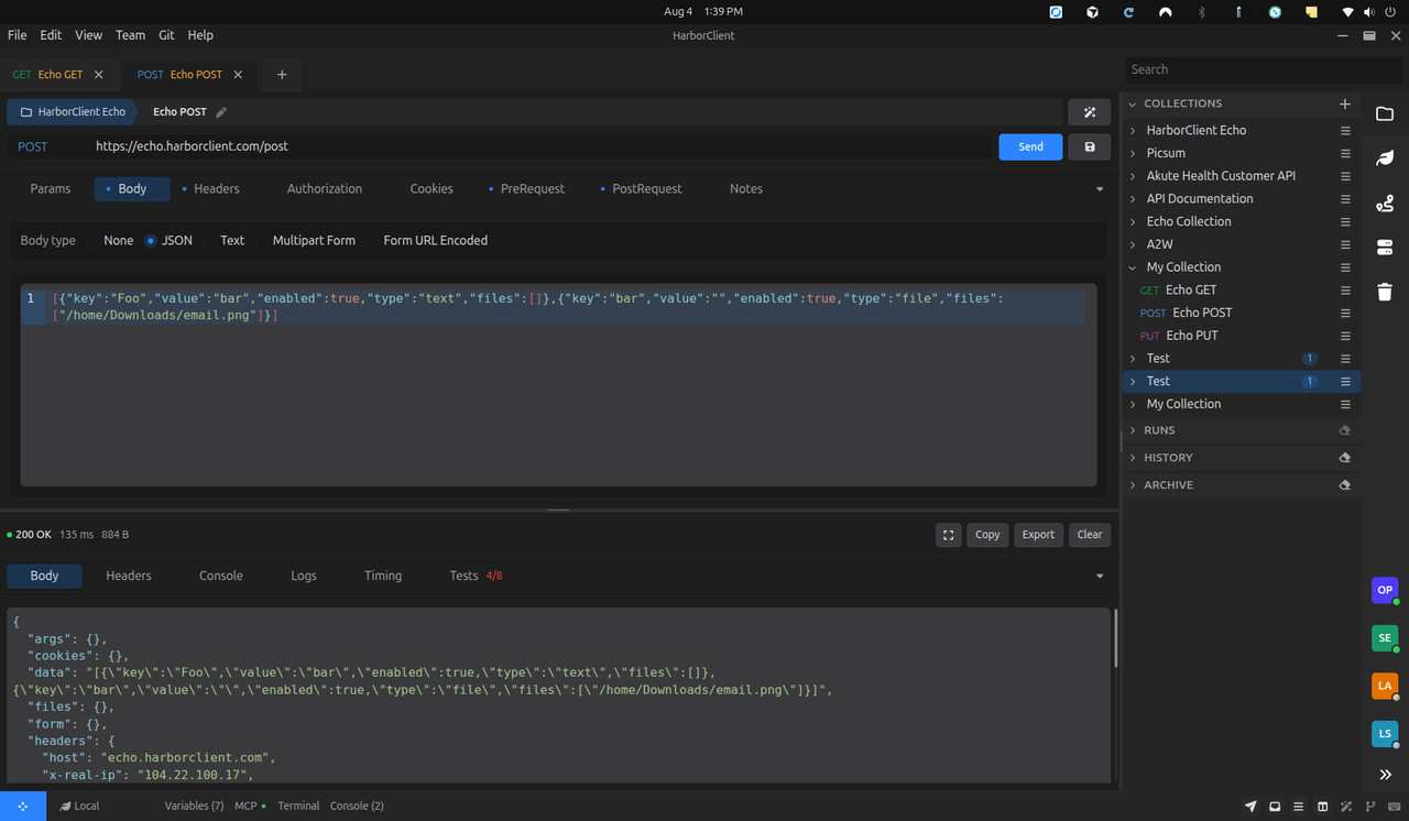
HarborClient’s window is a workbench shell: menus and chrome around a main request/response workspace, with sidebars and footer panels you can show, hide, and rearrange. This page covers the major UI surfaces and the controls that change what is visible.
Layout visibility is shared across three places:
| Where | What it controls |
|---|---|
| View → Appearance | Checkbox toggles for panels, editors, footer panels, and collections-sidebar display chrome |
| Footer | Quick toggles for the same panels and editors |
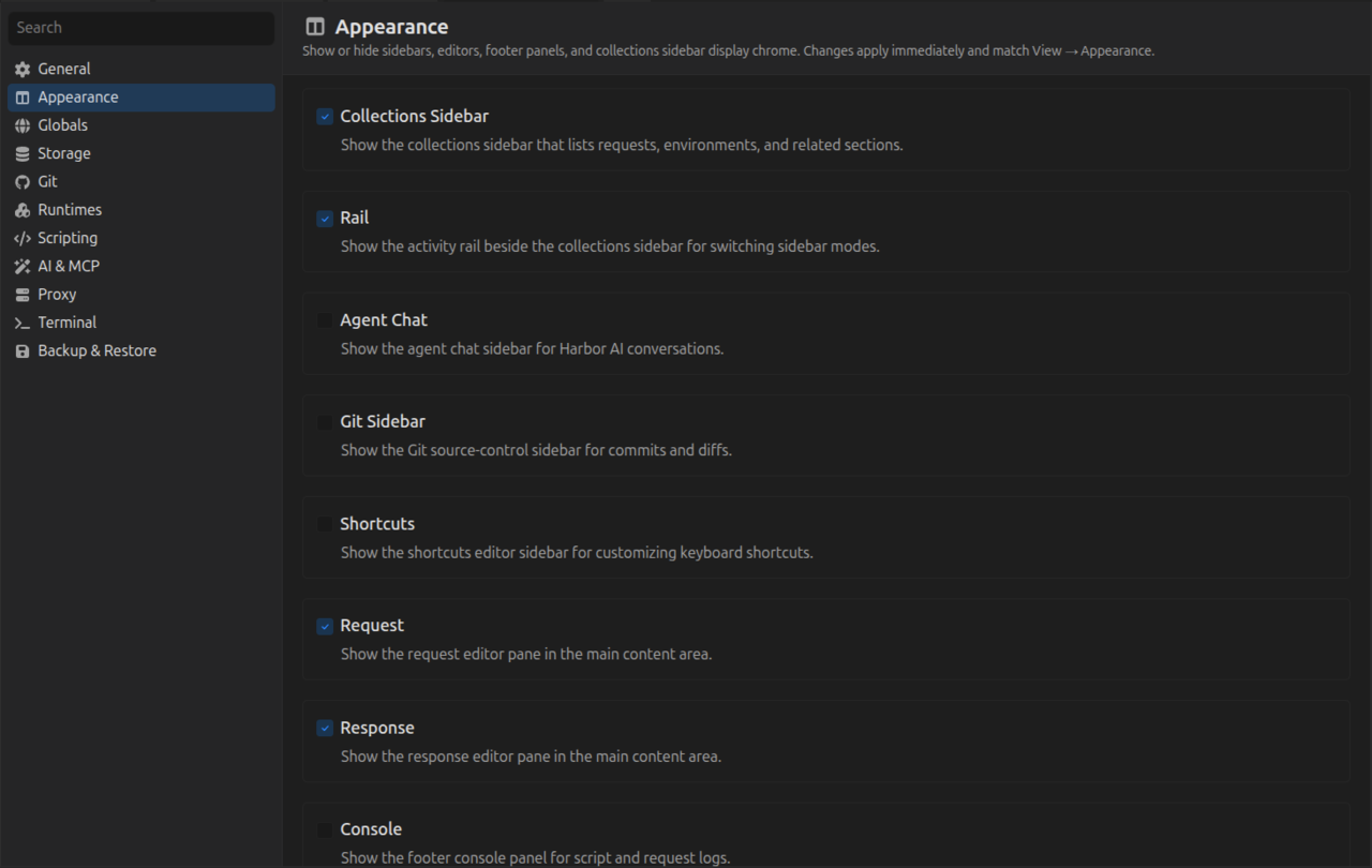
| Settings → Appearance | The same panel and display options, persisted with per-field reset |
Changes apply immediately and are remembered across launches.
Overview
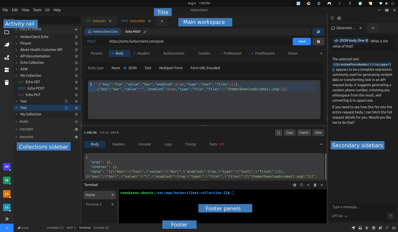
The shell has these main regions:
| Region | Role |
|---|---|
| Title bar / menu | File, Edit, View, Team, Git, and Help menus; theme and appearance controls live under View |
| Activity rail | Narrow icon strip beside the collections sidebar for switching sidebar modes (collections, environments, live pages, servers, and related sections) |
| Collections sidebar | Tree of collections, folders, requests, and related sections such as environments and workspaces |
| Main workspace | Tab strip plus the request and response editors (or browser / live-page content) |
| Secondary sidebars | Agent Chat, Git, Shortcuts, and optionally live-server logs docked beside the main column |
| Footer / status bar | Environment picker, slide-up panel buttons, layout icon toggles, and plugin status slots |
| Footer panels | Slide-up Console, Variables, MCP, Terminal, and plugin panels above the footer bar |
Main workspace
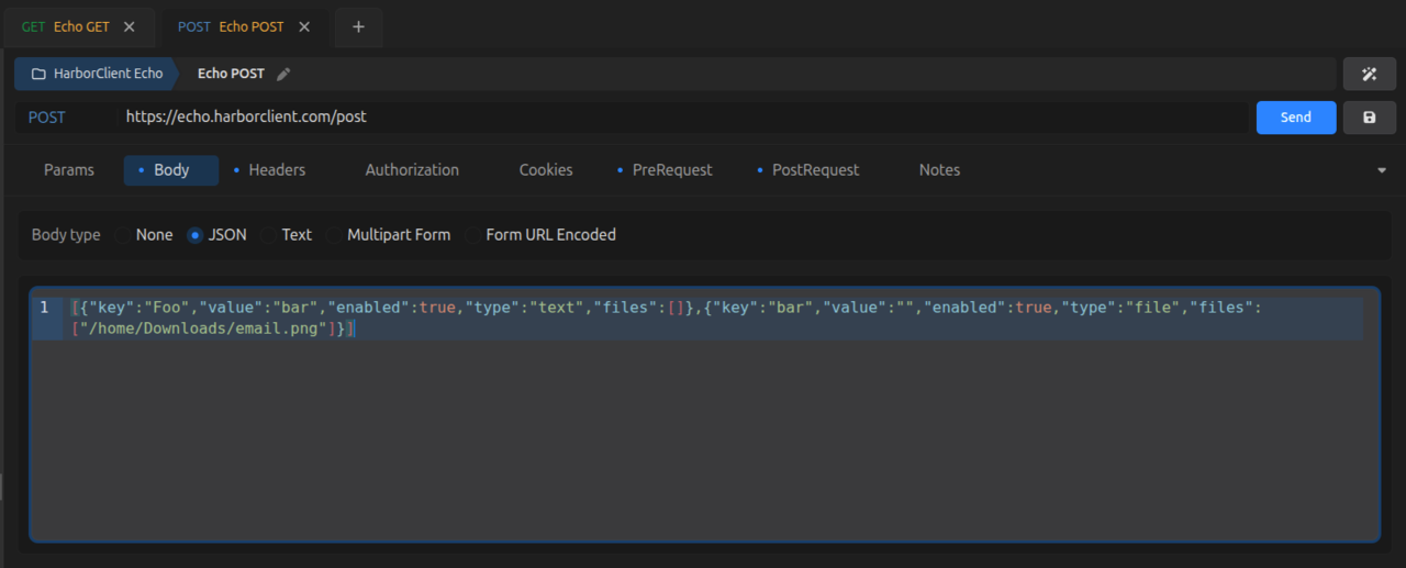
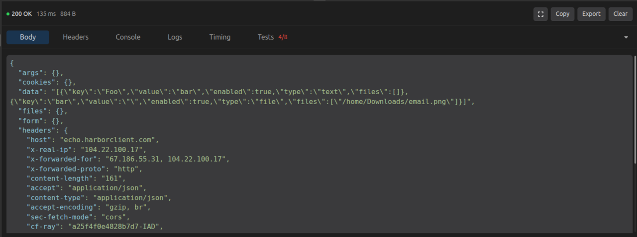
Open tabs occupy the center column. A typical HTTP tab splits into:
- Request editor — method, URL, params, headers, body, auth, cookies, and scripts. See Requests.
- Response editor — status, timing, size, headers, and body after a send. See Requests — Reading the response.
You can hide either pane independently so the other expands. Toggle them from:
- View → Appearance → Request / Response
- Footer icons for the request editor and response editor
- Settings → Appearance → Request / Response
Browser and live-page tabs use the same main column with their own chrome. See Live pages.
Activity rail and collections sidebar
The activity rail sits beside the collections sidebar and switches which sidebar mode is active (collections, environments, live pages, servers, and related sections).
The collections sidebar lists your saved work. Display chrome on those rows is optional:
| Control | What it shows |
|---|---|
| Storage locations | Badges naming which storage connection holds each collection |
| Color markers | Color dots assigned to collections, folders, requests, and related items |
| Highlights | HTTP method badges colored by method |
| Indicators | Status dots in History and Runs sections |
| Filters | Section filter controls (turning off clears active section filters) |
| Sorting | Section sort controls (turning off resets section sorts to default) |
Toggle these from View → Appearance or Settings → Appearance. See Collections for the sidebar guide and color coding.
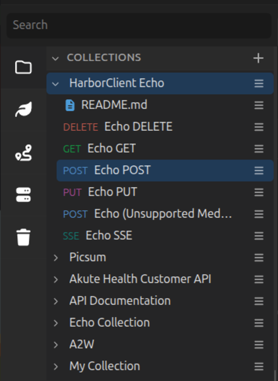
Secondary sidebars
Secondary sidebars open on the side opposite the collections sidebar:
| Sidebar | Purpose |
|---|---|
| Agent Chat | Harbor AI conversations. See AI assistant. |
| Git Sidebar | Source control for git-backed collections. See Git provider. |
| Shortcuts | Keyboard shortcut editor |
| Live-server logs | Access logs when docked as a sidebar instead of a footer panel. See Live servers. |
Open or close them from View → Appearance, the footer layout icons, or Settings → Appearance. Only one of Agent Chat, Git, and Shortcuts is open at a time on that side.
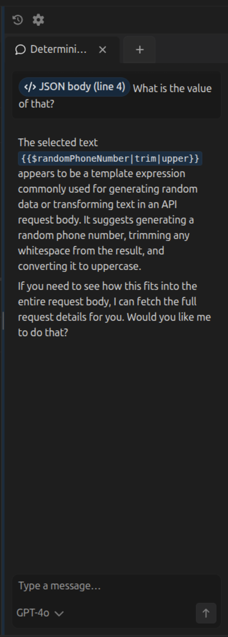
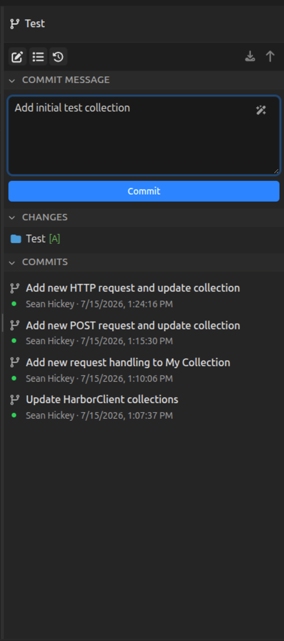
Footer menu and status bar
The footer bar has two groups of controls.
Left: environment and panels
| Control | Action |
|---|---|
| Environment | Pick the active environment (or clear it) |
| Variables | Open the resolved-variables slide-up panel |
| MCP | Open the MCP panel (shown when MCP is enabled in Settings) |
| Terminal | Open the embedded terminal panel |
| Console | Open the script and request console panel |
| Plugin panels | Extra footer buttons contributed by installed plugins |
Footer panels are mutually exclusive with each other and with exclusive editors such as live-server settings. Opening one closes another.
Right: layout icons
Icon buttons mirror View and Settings appearance toggles:
| Icon | Toggles |
|---|---|
| Request editor | Request pane in the main column |
| Response editor | Response pane in the main column |
| Rail | Activity rail |
| Sidebar | Collections sidebar |
| Agent chat | Agent Chat sidebar |
| Git source control | Git Sidebar |
| Shortcuts | Shortcuts sidebar |
The footer also hosts the Action menu launcher. See Action menu.


View menu controls
Use View → Appearance for checkbox toggles that match the footer and Settings Appearance fields:
Panels and editors
| Item | Default |
|---|---|
| Collections Sidebar | On |
| Rail | On |
| Agent Chat | Off |
| Git Sidebar | Off |
| Shortcuts | Off |
| Request | On |
| Response | On |
Footer panels
| Item | Default |
|---|---|
| Console | Off |
| Variables | Off |
| MCP | Off |
| Terminal | Off |
Collections sidebar display
| Item | Effect |
|---|---|
| Storage locations | Storage-location badges |
| Color markers | Color marker dots |
| Highlights | Method badge colors |
| Indicators | History / Runs status dots |
| Filters | Section filter controls |
| Sorting | Section sort controls |
Directly under Appearance and Theme, the View menu also includes:
| Item | Action |
|---|---|
| Hide sidebars | Closes collections, Agent Chat, Git, and Shortcuts sidebars plus open footer panels, and remembers the previous layout |
| Show sidebars | Restores the last Hide sidebars layout, or opens the collections sidebar if nothing was saved |
| Switch sidebars | Swaps collections sidebar placement between left and right (see Switching sidebars) |
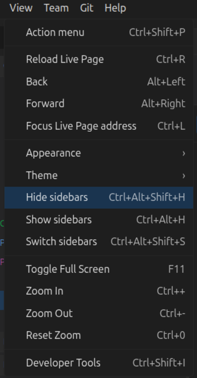
Settings → Appearance
Open File → Settings (or Cmd/Ctrl+,) and choose Appearance. The same panel and display checkboxes appear here with labels and descriptions, plus per-field reset to factory defaults.
There are two groups:
- App panels — Collections Sidebar, Rail, Agent Chat, Git Sidebar, Shortcuts, Request, Response, Console, Variables, MCP, Terminal
- Collections sidebar display — Storage locations, Color markers, Highlights, Indicators, Filters, Sorting
Toggles stay in sync with View → Appearance and the footer icons. See Settings for other settings sections.
Switching sidebars
By default the collections sidebar (and its rail) sit on the left, and secondary sidebars (Agent Chat, Git, Shortcuts, live-server logs) open on the right.
Choose View → Switch sidebars to flip that layout: collections move to the right and secondary sidebars open on the left. The placement is persisted with the rest of the panel layout.
What's next
- Settings — appearance, storage, proxy, AI, and more
- Action menu — search, commands, and slash actions
- Collections — sidebar guide, folders, and workspaces
- Requests — request and response editors
- Git provider — git-backed collections and the Git sidebar
- Live pages — embedded browser sessions
- Live servers — local servers and server logs